01
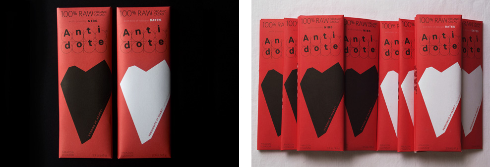
Concept & strategy, branding & packaging design, Illustration
To celebrate their first birthday Antidote Chocolate has released a heroic line of 100% raw cacao bars called the "heart line". It is a fact that cacao is good for the heart. Leading the vanguard is STRONG AT HEART, absolute cacao scattered with crunchy nibs, and riding valiantly alongside is PASSIONATE AT HEART, also pure cacao, and naturally sweetened with date fruit. Antidote has survived their first year and these two dark chocolates will help you survive all manner of opponents and obstacles as well as add some sizzle to those romance free moments. Each bar is named after an aztek god. Visit Website
02
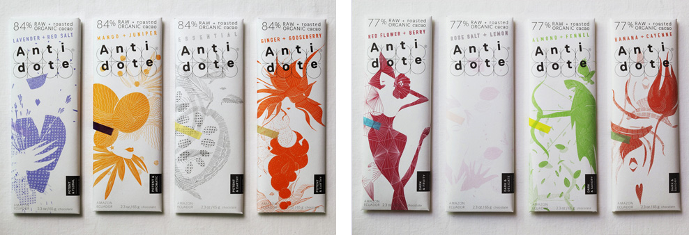
Concept & strategy, branding & packaging design, Illustration
Antidote Chocolate is a "health through pleasure" line of single origin dark chocolate bars made with raw & roasted cacao. Each bar is named after a Greek goddess, with one of eight flavor profiles to match. The packaging comes alive with a surrealistic illustrated interpretation of the deity, complete with an anecdote revealing the connection between each bar's goddess and antidote. The bright colors reflect the purity of its ingredients and refined quality of this premium chocolate. The pharmaceutIcal-inspired logo, in the form of a pill package, is carried over to the mold of the chocolate bar, which can be broken into 10 Antidote "pills" for instant gratification. Visit Website
03
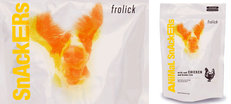
FROLICK PET PRODUCTS
Brand identity & packaging design
In developing the brand elements for this high-end, all-natural dog food from an innovative company, we focused on the special relationship between a dog and its owner. The logo's overlapping dog-in-motion sequence translates joyfulness, freshness and energy while making the brand very original next to competitors. The whole chicken stamp adds wit and communicates honesty and quality.
04
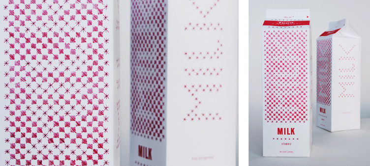
MILK
Brand identity & packaging design
Tripple Red reinvents the way to relate to everyday products. Here, we focused on the purity of milk - just a single ingredient - and its connection to the customer as something fresh, enriching and gratifying on the shelf, as well as on the kitchen table. The red-and-white pattern is reminiscent of a stitched, antique tablecloth, but the magic comes into play when the design element transforms into MILK when read from afar.
MILK was featured on several design and lifestyle blogs and Red/Tripple Red was recognized for the project by Luerzer's Archive in the book edition "The World's Best 200 Packaging Designers".
05
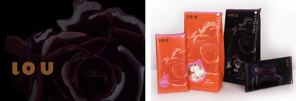
LOU TRUFFLES
Brand identity & packaging design
Our strategy taps into consumers' association of quality with beauty and plays with concepts of desire and seduction. To that point we visualized the luscious taste of chocolates through a single rose in full bloom. The unique design concept differentiates itself from competitors through simplicity (the solid color per flavor) and elegance (the exquisite rose imagery). The color palette is refined for our zeitgeist as the aesthetics match a contemporary lifestyle. This project was inspired by a proposal to a major chocolate brand.
06
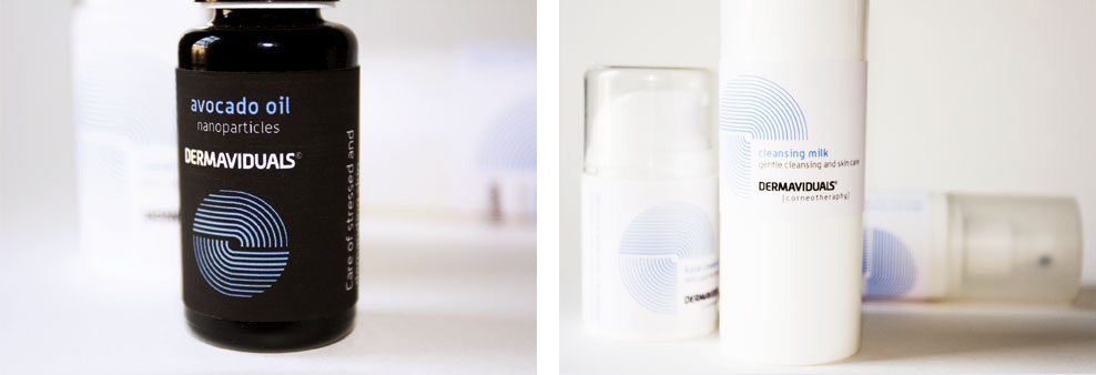
Brand identity & packaging design
Dermaviduals is a German scientific and dermaceutical skin care line. Tripple Red was asked to create a new brand identity for the product lines launch in the USA and Canada. The brand is based on a modular system that allows users to mix individualized combinations of the products. Our graphic icon symbolizes a fingerprint as well as the layers of the skin. A smart visualization for this personalizable modular skin care system.
07
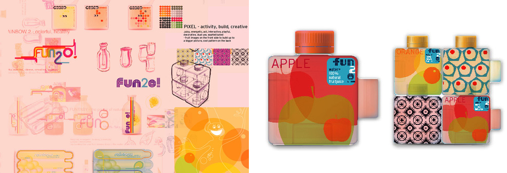
Brand innovation concepts
Various concepts for brand ideation of a drink for kids. The marketing idea was around a playful element to incorporate within the brand concept. Ideas ranged and derived from the concept of pixel-play, puzzle, share, discover, build and re-use of the empty bottle. One of the concepts promotes playful container with interconnecting fruit juice bottles featured colorful graphic elements and encouraging themes.
08
SPRITE
Brand redesign / for Future Brand
Tripple Red was commissioned by FB to re-imagine the Sprite brand for a contemporary mindset. Our concepts centered on capturing the timeless fresh essence of the product with a charismatic, simple and vibrant design.
09
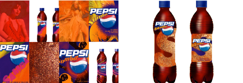
Packaging design / for Raison Pure
Pepsi Samba is a tropical fruit-flavored cola with the taste of mango and tamarind developed for limited release. Tripple Reds design concept merges the spirit of Rio de Janiero with carnival-inspired graphics and color palette in an irresistible package that makes you wanna dance!
10
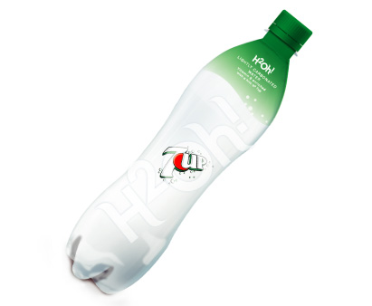
H2oh! BEVERAGE
Brand & packaging concept
11

Identity & packaging design
Working under tight deadlines and with limited financial resources, Tripple Red developed a series of labels and packaging design for Consumer Products NYs American market that yielded instant results. Products were designed for a mainstream clientele and sold at TJ Maxx and Bed, Bath & Beyond where they proved very successful with high sales.